
partida tequila redesign
(PROPOSED)
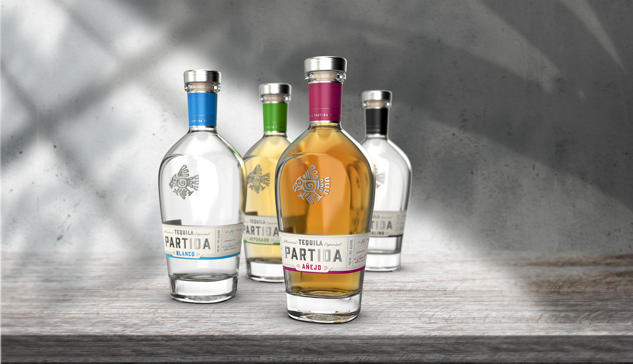
The Partida family has held the age old tequila making tradition for generations. With the dream of marketing this spirit to a new and broader international audience, the family commission a new design to appeal to the new consumer while also communicating the pride in their tradition and process. The symbol of the bird was derived from a folk tale describing the discovery of tequila. A bird happens upon the agave plant and drinks the fermented nectar inside. The villagers, noticing the strange behavior of this bird, investigate. And so marks the discovery of tequila. The package maintains a clean appearance with an emphasis on a custom glass shape and the rich color of the tequila.
Studio: Bright Design
Creative Direction and Design: Christy Van Deman
Project Leads: Tuire Kontiainen and Christian Klawitter
Photography: Paolo Marchesi


CURRENT PACKAGE DESIGN
Partida tequila redesign
Partida’s redesign effort achieved a more compact use of shelf real estate, while also elevating the perception of premium quality through enhanced refinement of logo and label design.
PROPOSED PACKAGE AND IDENTITY RE-DESIGN
partida tequila brochure


